DHS S&T Year in Review
Supporting a Government agency's transition from a printed annual report to an interactive digital product.
Sector:
Government
Client:
U.S. Department of Homeland Security
Science and Technology Directorate
Role:
Product Management | Product Strategy | User Research | UX Designer
Background
The Science and Technology Directorate (S&T) is the science advisor, and the research and development arm for the U.S. Department of Homeland Security (DHS). S&T works to detect, protect against and counter major threats to the U.S., while looking to speed response and recovery operations for intentional, accidental or natural disasters.
Each year, S&T publishes a Year in Review product highlighting its many accomplishments. Historically, the document was distributed as a 90+ page printed publication and PDF. In 2015, S&T released its first digital version of the report via an interactive web experience. Analytics from the inaugural product revealed very short view times and little engagement on the site.
Our role as the design team was to develop an improved product for the 2016 Year In Review, which would showcase S&T’s accomplishments in a digestible and intuitive format to keep stakeholders informed and engaged.
Interviews
At the discovery phase of the project, the team conducted both user and client interviews to identify pain points with the product.
User Insights
The page felt like a "never-ending scroll"
Couldn't quickly jump to the information they were interested in because of confusing navigation and unclear labels
Not interested in S&T's organizational structure, processes, and programs and often left the site before reaching the accomplishments section
Visuals were interesting, but appeared very large and got in the way of the flow of content
Client Insights
Accomplishments information was buried on the page
Unhappy with the amount of time users spent on the page
Concerned that S&T's good work was not being communicated to critical stakeholders
Liked the use of videos and graphics to support the storytelling
Product Analysis
We conducted a detailed analysis of the website to identify issues that may have hampered the user experience and client goals.
Site Structure
The website was a single-scroll page for a very lengthy amount of content, which made it very challenging to understand where you were on the site.
Load Times
The site was hampered by slow load times for graphics, videos, and interactive animations often leaving large blank areas on the page.
System Familiarity
The site didn't follow familiar conventions for navigation or information hierarchy, which placed a heavy burden on the user when becoming oriented with how to move around the site.
Storytelling
With the goal of communicating yearly accomplishments, the information was buried at the bottom of the page. Overall there was too much content written with government/scientific lingo that lacked engaging narratives.
Personas
Based on our client interviews and stakeholder data, we crafted personas that would help focus our design decisions and serve as a guide throughout the development process.
Design Approach
After completing our research, we identified a few insights to drive the design decisions going forward.
Simplify
Show accomplishments front and center and strip away all unnecessary information
Ease
Adapt familiar conventions for navigation and information hierarchy for an intuitive experience
Enlighten
Utilize plain language writing to share accomplishments in a compelling narrative
Empower
Give users control by letting them decide how deep of a dive they want to take
Architecture
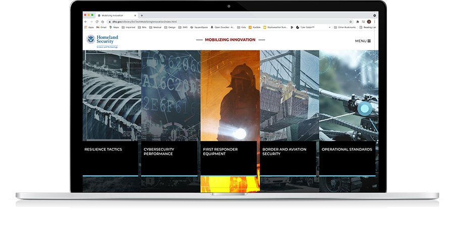
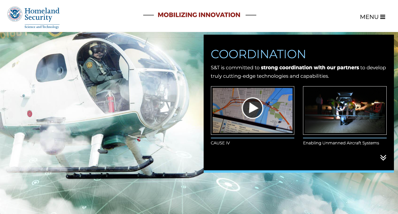
We organized the site around S&T's five research and development focus areas. This allowed us to showcase S&T's accomplishments front and center, while also providing users quick access to the information of interest to them.
The decision to utilize a multi-page site allowed for ease of navigation and the ability to layer content. Providing content through progressive disclosure decreased the chances of users feeling overwhelmed; instead it enabled them to control how deeply they wanted to explore a given subject matter.
Design
In the wire-framing process, we explored several different homepage structures that focused around the navigation of the five R&D focus areas.
We built a very bare-bones prototype of the site architecture to test with users for understanding. We also tested the navigation against accessibility standards given S&T’s strict guidelines around compliance.
Once we solidified the site architecture, we moved into hi-fi mock-ups to establish the look and feel of the site.


Takeaways
The 2016 S&T YiR site delivered a product that significantly improved the user’s ability to gather information about S&T’s successful R&D work in areas that were of specific interest to them. The emphasis placed on storytelling and content hierarchy during the research and design phase proved to be fruitful in addressing the issues of keeping the user engaged and on the site.