KinView
A calendar app that allows families to spend less time scheduling and more time living.
Sector:
Consumer
Client:
Personal Project
Role:
Product Strategy | User Research | UX Designer | Visual Designer
Background
Like so many other parents juggling work, appointments, school events, sports practice, birthday parties and date nights, my husband and I were struggling to keep track of our family's busy schedule. We were utilizing several different tools - paper calendars, white boards, phone calendars, text and emails, but this left us with scattered information that required constant communication to make sure we had the same schedule. I started researching available calendar apps to see if any of these tools would fit our needs and was underwhelmed with the options. Looking to challenge myself with a personal project, I saw this as an opportunity to build and test a product.

Research
I started the research process with a competitive analysis of some of the more popular family planning apps.


Interviews

Key Findings
Scattered information
Lack of quick visibility and access
Details are often lost in verbal conversation
Check in with spouse one or more times a day regarding family schedule
Schedule management is time consuming and burdensome
Needs/Wants
One central location for family schedule
Easily access and update from anywhere
Quickly view schedules and to-do list
Spend less time managing and communicating family schedules/activities


Busy parents need a way to track and share their family’s schedule because they want to spend less time managing their schedule and more time enjoying their family.
Persona
Based on my research and interviews, I developed a persona whose goals and characteristics represent the needs of the larger user group. By understanding the behaviors, concerns, and motivations of my target users, I was able to stay focused on developing a product that would satisfy users’ needs and therefore be successful.


Iterate & Test
I pulled together some very rough index card sketches to utilize for paper prototype testing with users.


Feedback from the testing highlighted the fact that the app included too many features and had some labeling issues. With this information in mind, I continued with sketches until I felt I had a strong enough concept to move forward with wireframes.
Prototype Testing
I build an interactive prototype using low-fi wireframes for the next round of testing.

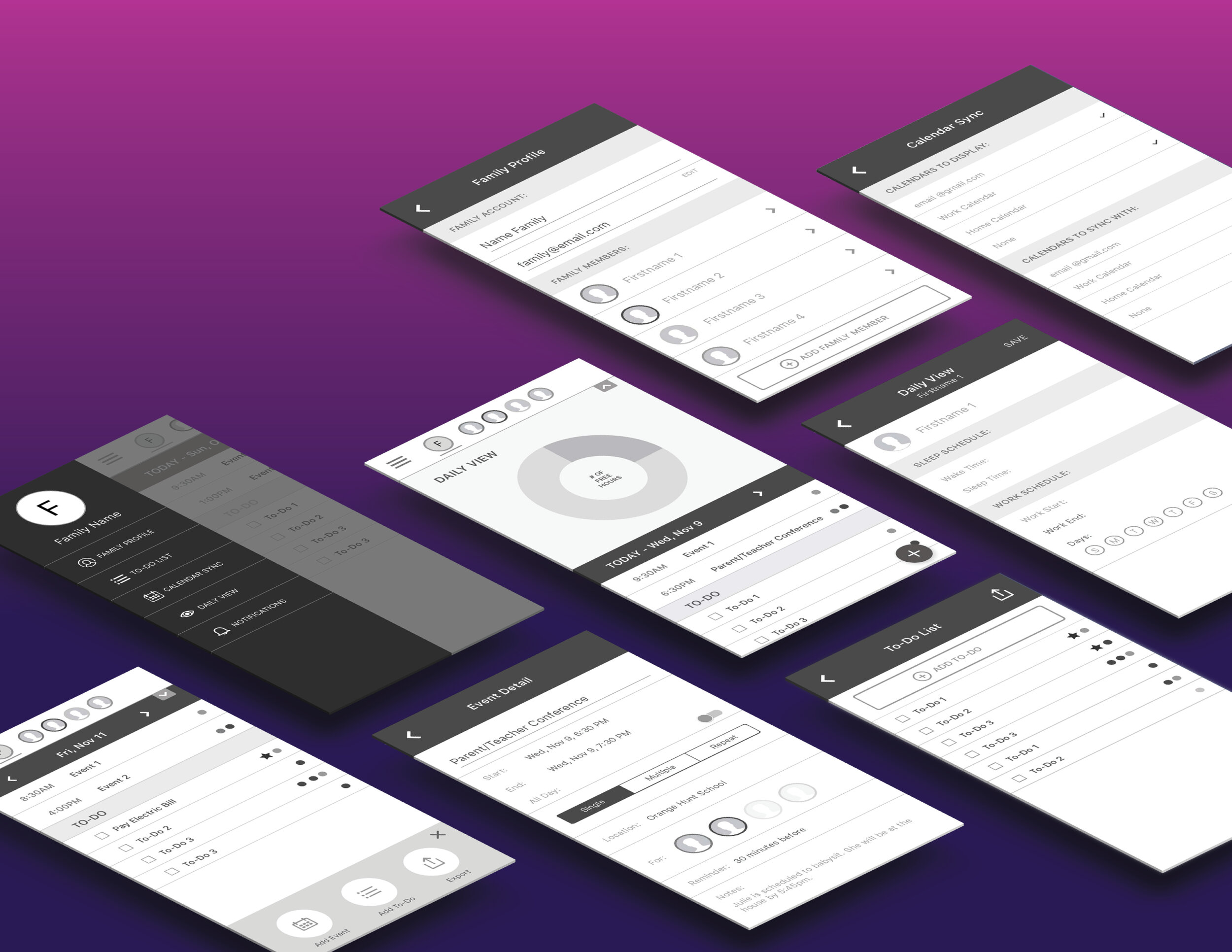
Hi-fidelity Mock-ups
By separating the Daily View feature from the list of today’s events/to-dos, the information is less cluttered and can be viewed quickly and easily. The new Daily View screen is now the welcome screen the greets the user after sign in, giving them a quick glimpse of how full their family’s day is.
Previous usability testing revealed confusion with the labels in the Calendar Sync settings. With calendar syncing being a integral part of this product, updates were made to the labels to provide clarification around importing and exporting data to calendars.
Takeaways
Throughout this journey, I found it extremely important to keep the goals of the user front and center. The frequent user testing of prototypes throughout the process provided key insights on how well I was aligning the app concept to the user goals. In early iterations I found myself trying to include too many features, which made the app feel clunky and not distinct from many existing family scheduling apps.
After stripping out unnecessary features and reconsidering the way data was being displayed, a schedule management product emerged that was the simple and easy to use.